Challenge
Where science meets
timeless beauty
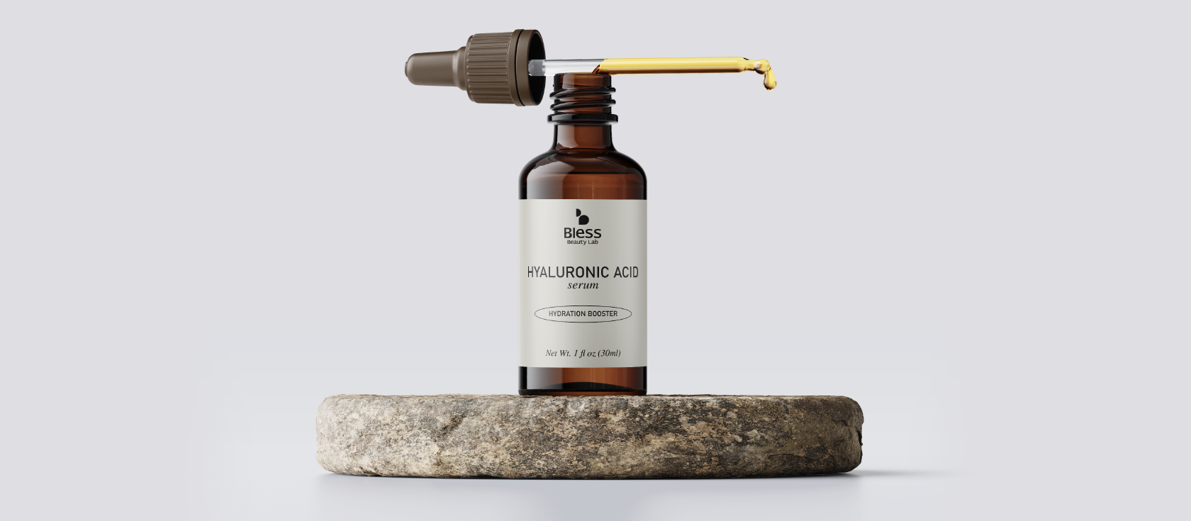
Bless Beauty Lab personifies sophistication and purity in the realm of high-end skincare. The founders came with a clear vision: a brand that curates experiences where luxury meets uncompromising effectiveness where true beauty is found in simplicity, science, and exceptional quality.
The challenge was translating that philosophy into a visual identity that could compete with the world’s most refined beauty brands from packaging to digital presence while maintaining a singular, unmistakable character.
Approach
Elegant minimalism
as a philosophy
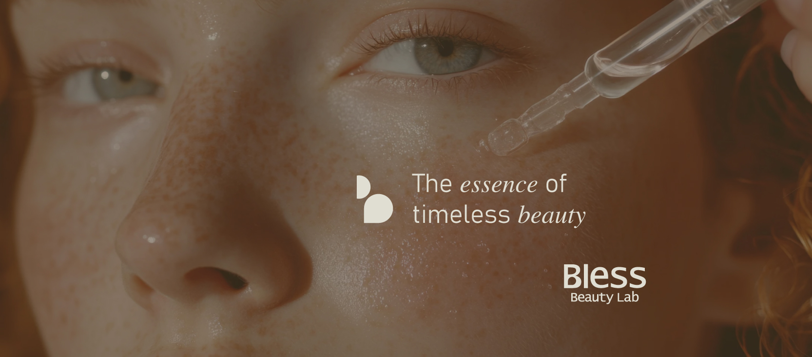
The concept was built around the idea that sophistication needs no excess. Every element from formula to packaging had to be designed with precision and intention. The visual identity mirrors this philosophy: clean lines, balanced proportions, and a quiet elegance that speaks volumes.
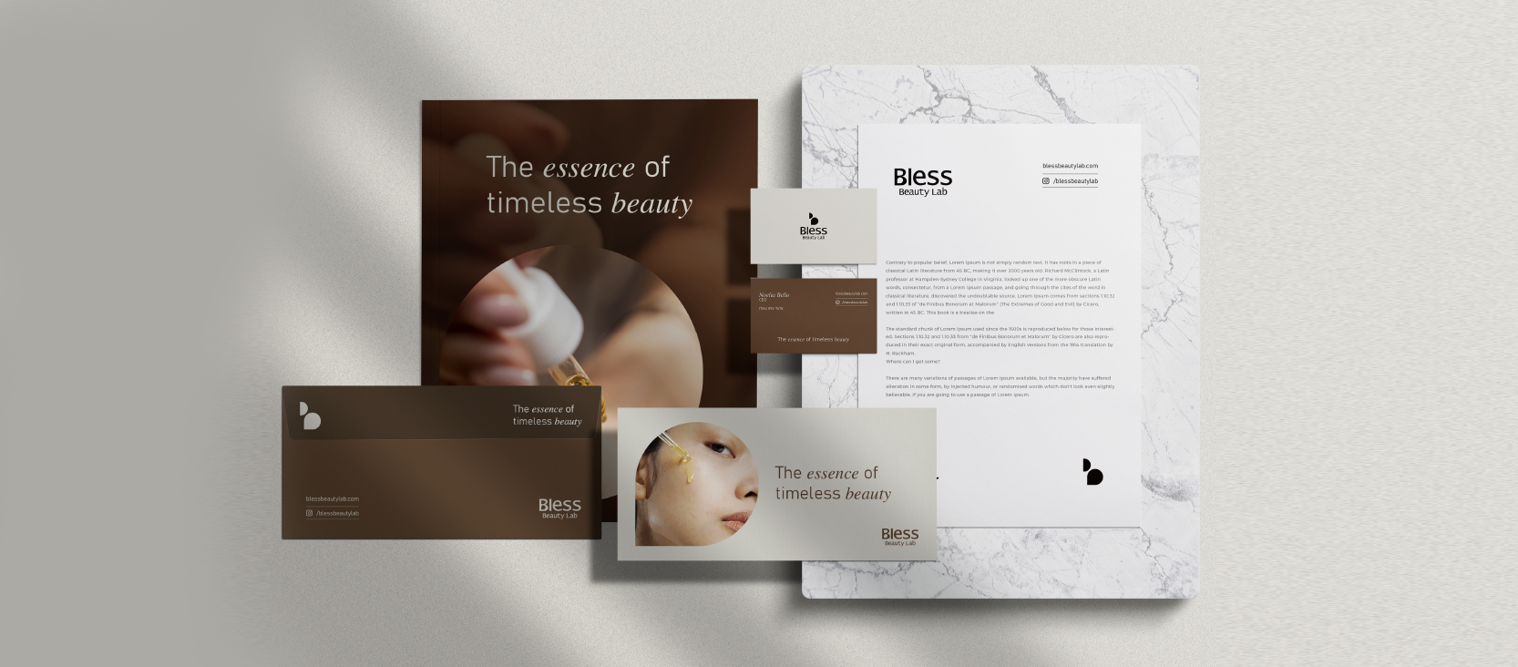
The palette of warm earth tones and marble whites references the natural ingredients at the core of the brand, while maintaining a luxury positioning that feels effortlessly international. The typographic system balances a modern sans-serif with a refined serif precision paired with warmth.
Brand Essence
"The essence of timeless beauty"
The Symbol
The Drop — more than
a logo mark
The logo’s drop is the soul of Bless. More than a stylized letter “B,” it represents purity, potency, and the essential core of every creation. A single drop carries the promise of hydration, nourishment, and renewal a symbol of concentrated excellence.
Minimal in form, profound in meaning: it reflects the power of quality distilled to its purest essence. The mark works at every scale from an embossed detail on packaging to a bold social media presence.
Solution
A complete brand
ready for the world
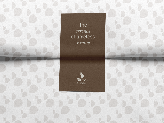
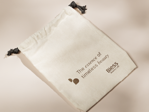
The final delivery included a complete branding package: logo system with the Drop symbol and its variations, a refined color palette of warm taupe, marble white, and gold accents, full typography guidelines, and a comprehensive brand essence document defining the visual and verbal identity.
Applied materials included business cards, letterhead, and a complete social media asset kit everything the brand needed to launch with confidence and consistency across every channel.
Results
The outcome
Bless Beauty Lab launched with a visual identity that positions it as a credible premium brand from day one confident, cohesive, and built to grow. The brand system gives the founders everything they need to communicate with the sophistication their product deserves.