Challenge
A brand as powerful as
the women he works with
Carlos D Pompeio is not a makeup artist in the conventional sense. He directs perception. His clients are women who occupy power, executives, celebrities, brides, and public figures who understand that image is not about aesthetics. It’s about strategy.
When he came to me, the brief was clear: the brand needed to match that level. It had to feel modern, elegant, and commanding, capable of moving through any environment with authority, from a fashion editorial to a boardroom.

Approach
Modern, elegant,
imposing
The concept was built around Carlos’s own methodology — CII, Controle de Imagem e Impacto — the idea that every visual choice is a deliberate act of perception management.
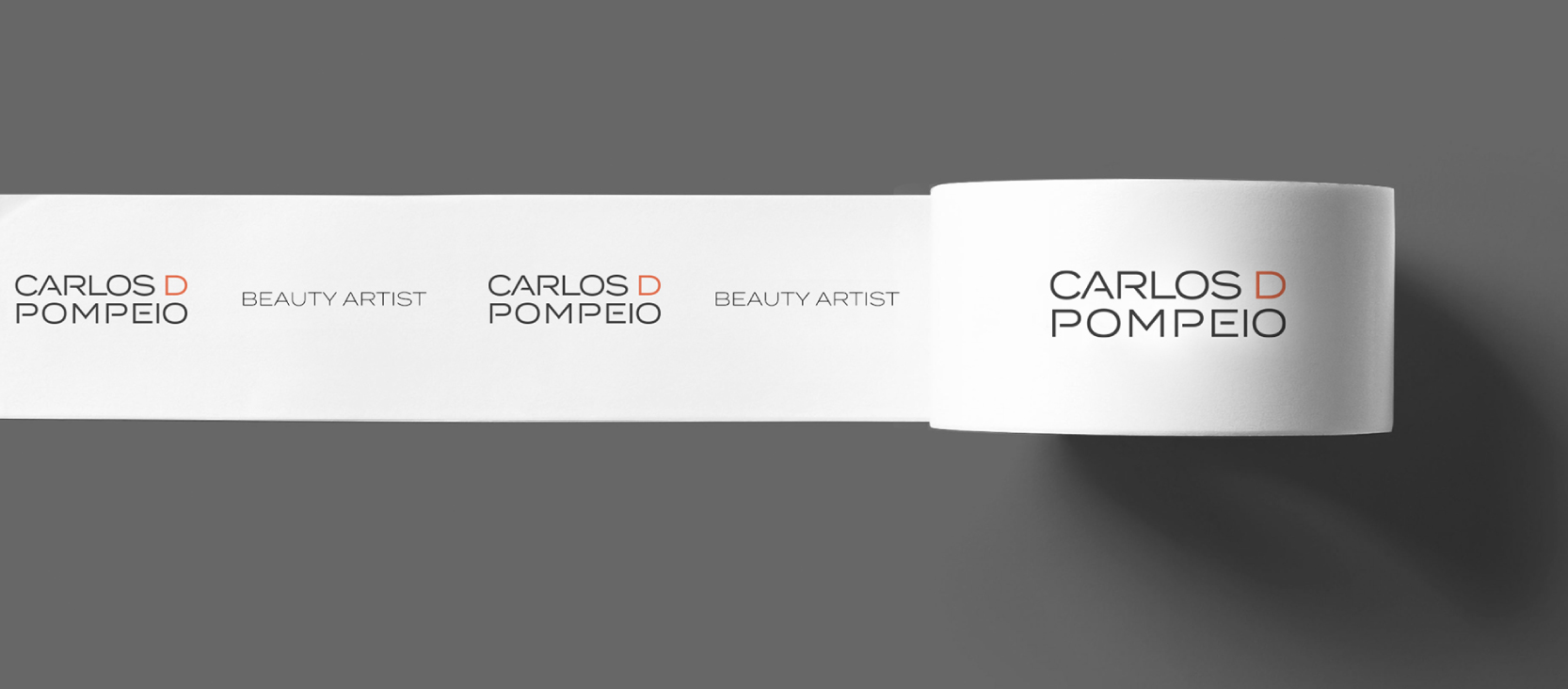
The logo was developed from a sans-serif typography with letterforms designed to feel expansive and precise. Wide tracking, strong presence, zero excess. The red in the palette chosen in an open, confident tone was the key decision: it carries irreverence and authority simultaneously, referencing a brand that is bold without being loud.
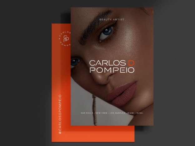
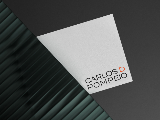
The full system was designed to hold its integrity across every format, from a business card held in someone’s hand to a large-format backdrop on a fashion set.
Solution
A visual identity
built for influence
The final identity system encompasses the logo and its variations, a refined color palette of deep charcoal, clean white, and signature red, typography guidelines, and a complete set of branded materials stationery, business cards, and digital applications.
Every element was designed with one principle in mind: exclusivity without ostentation. The brand communicates power quietly exactly the way Carlos’s work does.
Results
The outcome
The new identity positioned Carlos D Pompeio as a premium brand in the Brazilian beauty market, consistent with the caliber of his clients and the sophistication of his work. A visual system that reflects not just what he does, but who he does it for.