Design that moves
businesses
forward.
Strategic design for companies that want to grow.
Brand identity, UX and visual communications for companies worldwide.
About
Design is a
business decision.
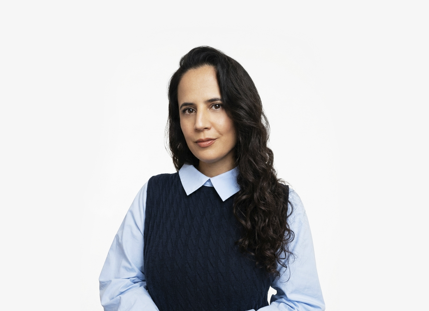
For over 10 years, I’ve been turning ideas into brands, experiences, and visual identities, working across branding, UX, and visual design.
I like working where business and people meet, understanding what a company is about, what people need, and how design can bring the two together in a clear and meaningful way.
I’ve worked with businesses at different stages, from creating brands from scratch to helping existing brands grow and evolve. My work sits somewhere between designer, strategist, and problem-solver. I like asking questions, finding the right direction, and making sure the design has a purpose before making it look good.
I believe the best brands aren’t just well designed. They know who they are.
What I do
Most demanded
services
From brand strategy to digital experiences, these are the ways I help businesses turn ideas into meaningful brands.
A complete visual identity system for companies that need to command respect before saying a word. From logo concept to full brand guidelines.
Websites and digital products designed to convert. From problem definition through research, wireframes, and final UI ready for development.
Presentations that win rooms. Whether pitching investors, presenting to a board, or speaking at a conference, decks that tell a compelling story.
Complete visual systems for conferences and corporate events. From the first invitation to the last badge, everything cohesive and production-ready.
Work that
speaks for itself
A selection of projects across branding, UX and visual communications.
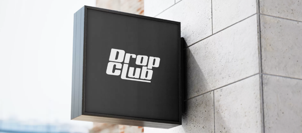
Brand Identity · Fashion · E-commerce
Drop Club
Brand identity for a premium sneaker e-commerce
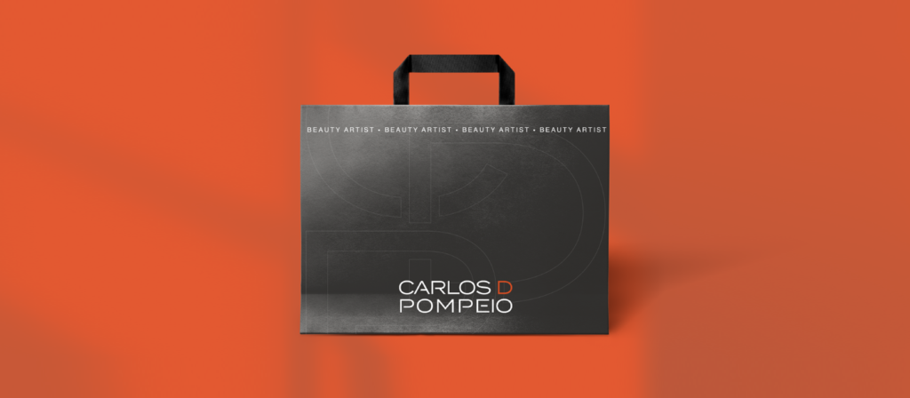
Brand Identity · Beauty · São Paulo
Carlos D Pompeio
Brand identity for a premium beauty personal brand
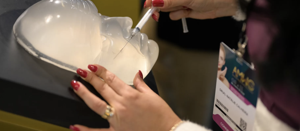
Event Design · Medical Congress · Brazil
AMWC Brazil
International medical congress identity
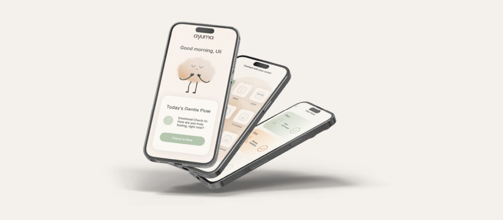
UX/UI Design · Wellness App · Conceptual
Ayuma
Mindful UX for an Ayurvedic wellness app
What clients say




Ready to grow
your business?
Have a project in mind? I would love to hear about it.